Create Your First Project
Start adding your projects to your portfolio. Click on "Manage Projects" to get started
Kontrollavgift
This UX project focused on redesigning Kontrollavgift.se, a digital platform where users can dispute control fees (p-bots) received on private parking lots. The goal was to reduce user confusion, minimize incorrect dispute submissions, and improve the overall usability of the site particularly for users unfamiliar with the difference between a kontrollavgift and a felparkeringsanmärkning (municipal ticket).
We followed the Double Diamond design process, applying methods such as user interviews, usability testing, crazy 4 ideation, persona development, and iterative prototyping to identify pain points and propose design improvements.
Research Insights:
In the Discover and Define phases, we gathered qualitative data through interviews and usability tests. We also created three key personas:
The Frustrated Vehicle Owner
The Non-Tech-Savvy Senior
The Language-Challenged User
From this, we identified the following problems:
- Users confused control fees with municipal parking violations, leading to disputes being submitted to the wrong authority.
- It was hard to find the dispute form: it was buried below FAQs.
- Users disliked manually entering the long OCR number and expected a scanner option.
- Key features like payment info and contact details were difficult to locate.
- Design issues, like poor contrast and confusing icons, affected readability and navigation.
Design and Prototyping:
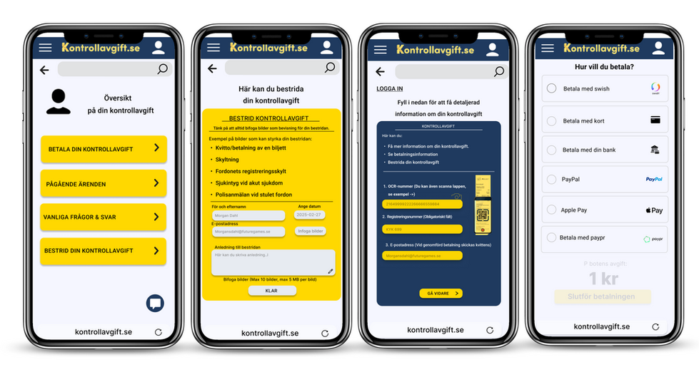
In the Develop and Deliver phases, we held a Crazy 4 workshop to sketch potential solutions. We then created a prototyp in Figma with the following improvements:
- Restructured information hierarchy: Placed the dispute form at the top.
- Added clearer explanations: Helped users distinguish between control fees and other tickets.
- Suggested OCR scanner functionality: To reduce manual input errors.
- Improved visual clarity: Better contrast, intuitive icons, and simplified layout.
- Reorganized FAQ: Less cluttered and easier to scan.
The prototype was tested and iterated based on feedback from real users.
Final Outcomes:
Our redesigned prototype aimed to:
- Reduce irrelevant dispute submissions
- Clarify the purpose of the platform
- Improve navigation and task completion speed
- Minimize user frustration and increase trust
The project ultimately made the experience simpler, more accessible, and aligned with the expectations of real users. Especially those less tech-savvy or unfamiliar with dispute processes.


